
Product Design Lessons
Intro to Foundation | Lesson #165
Zero to Website Guide
Part 5:
Styling Your Scaffold
Learn how to apply visual styles to your scaffold.
Welcome to part 5 of our 6 part Zero to Website Series! By the end of this 6 part series, you’ll have learned how to build a responsive website with Foundation. In last week’s lesson, we scaffolded 3 pages of your portfolio site using Foundation’s grid. Today, we’re going to dive into our CSS and start styling our site! In this lesson, you’ll learn how to style Foundation’s components as well as write your own CSS to style your portfolio. Let’s get started!
Getting Started
Let’s first break down the different areas of visual styling we’ll focus on today. There are several major areas that will define the look and feel of the site: spacing, color, font choice and sizing, and imagery. In visual styling, we want to cover these areas in broad sweeps, meaning we’ll start by styling the outermost containers of our HTML and move inward. This is usually in the <body> tag, so that we can capture the styles of most things at once. Once we have our body styles defined, we’ll move onto styling smaller areas of the site. This is where we’ll create more specific classes for individual elements to get the site to look exactly as we want it.
Styling the Body of Your Site
In the <body>, we want to define the major styles that will span across every single page of our site. Let’s take a look at our design.
Laurel’s portfolio has a slight gray background color, a custom font, and a good amount of padding around all of the content. We’re going to use the a free font, Nunito, as our body font. It looks a bit different from Laurel’s font, but that’s okay. To hook up our custom font, we’re going to place this code in the <head> of our index.html, about.html, and contact.html files:

Now we can reference this font in our CSS. Let’s head to app.css and specify our body font, background color, and padding:

Note: We’re using a shorthand form of CSS padding. “3rem” defines top and bottom padding, “1rem” defines left and right padding.
If we take a look at the site in our browser, it’s already looking nicer with this new font!
Header Styles
Next, let’s move onto header styles. Headers are universally used throughout our pages and play a big part in defining the visual hierarchy of our site. In Foundation, there are basic styles for <h1> through <h6>. We’re going to override some of those styles so that these headers are optimized for our portfolio.
Depending on how dense your content is (and your personal preference), you’ll use varying font-sizes for your headers. For this design, we only really use a header (it should be an <h1>) once in our about.html and contact.html pages. Since the default size of <h1> is much too large, we’re going to override the font-size: to 1.3rem in our app.css:

Note: If you’re wondering, “why are we using <h1> if we’re going to resize it anyways?”, the answer is because it’s the only header we’re using. For accessibility purposes, we always want to start with <h1> and follow through to <h6> in order of use.
Header fonts are defined separately from body fonts. We’re going to use a heavier display font, Montserrat, as our header font. Again, hook it up in the <head>, then specify font-family and font-weight inside of our app.css:
Styling by "Section"
Now that we some basic styles defined, we’ll focus in on smaller sections of the site and style them in more detail with custom classes.
Header Nav
Let's begin with the header navigation area. During scaffolding, we used the helper class .text-center to center our content in this column. In this phase, we’re going to clean up our markup by creating a custom class for our header navigation area and moving these styles into our CSS file. Remove .text-center and wrap everything inside of the column in another <div> with the class .header-nav.

Let’s write some CSS to center the header nav content with our new class and also fix the spacing. Our design shows a good amount of space between the header and gallery area.

Next, let’s add some spacing under our logo by targeting the <img> inside of .header-nav:

Now that we’ve corrected the spacing, let’s link up our image in the <img> tag and make its width 100px in our HTML:
Next, we’re going to add some styling to the text beneath our logo to make it look more like a subheader. Since this is the only place we’re using this text styling, we’ll give it a more specific class name of .header-nav-subtitle.

In our CSS, we’ll apply some letter-spacing and give it a specific font-size so it’s not affected by other <p> tag styles:

Let’s move onto our menu. We’re going to give our <a> tags inside our menu the class .header-nav-link:

In our CSS, we’ll write styles that will capitalize our links and make them bolder:

Next, we’re going to set some hover styles to make our links look a little nicer. To do this, we’ll target the hover state of our links:

You may have noticed in our menu that the link for the current page we’re on is highlighted in a different color. To achieve this styling, create a class .active and apply it to the page link that we’re on. In index.html, we’ll add .active to our ‘Portfolio’ link:

Then, write some CSS to change the color of the link:

Our header should look like this in the browser:

Since our header navigation will be the same on every page, we’ll copy and paste this code into our about.html and contact.html pages. We’ll also move the .active class in each page to the appropriate links. In about.html, move .active to the About link. In contact.html, move it to the Contact link.
Gallery
During scaffolding, all we did was set up a block grid for the gallery area. The default block grid took care of most of the styling for us, now all we need to do is give the gallery some padding and replace our placeholder images with actual images.
To give the gallery some padding, we’re going to take the entire gallery area (starting from the row), and contain it in a <div> with the class .content.

Note: We’re encasing the row because we don’t want to break the block grid by encasing the columns.
Now let’s give the .content class some margins:

Next, we’re going to put all of our images inside of <a> tags because clicking an image should lead to an individual project page (which we haven’t built for this lesson). The code should look like this, with your own images linked in each <img> tag:

Footer
Next, let’s replace each placeholder image with social media icons. Let’s grab some icons (I like to use iconfinder.com) and link them in our <img> tags and set their widths so that they’re all look the same size.

Make sure to copy and paste the footer into your about.html and contact.html files!
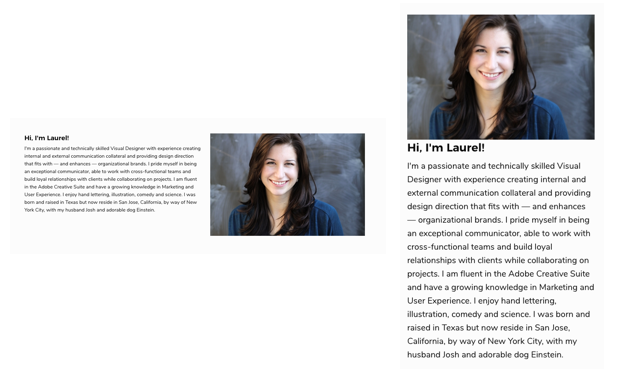
'About' Content
Let’s move on to our about.html content. The header and footer will remain the same, all we’re styling here is the middle content. Again, let’s take the entire middle section and encase it in a <div> with the class .content to give it top and bottom margins.

Next we’ll replace the placeholder image with a our own picture (I’m using Laurel’s photo in this case!)
The next thing we’ll do is called source ordering. This means we’re going to rearrange the columns so that on small our image will show up on top of our text, while on medium the image shows up after the text. During scaffolding, we set up our HTML so that the image comes after the text, but here we’re actually going to flip it around and place the image column first. This is because with source ordering, we want the HTML to reflect what we see on a small screen.
Now we’re going to add some source ordering classes. In our image column, we’ll add the class .medium-push-6. In our text column, we’ll add the class .medium-pull-6. The push class is telling the image column to “push” over 6 columns on medium, and the pull class is telling the text column to “pull” back 6 columns on medium.
Here’s what our page looks like on small and medium:
'Contact' Content
Moving on, we’re going to start styling our contact page! Again, let’s wrap the entire middle section in a container with the class .content to give it some margin spacing.
Our text is already looking good, so we’ll just focus on the contact form. The main areas we’ll style are the default and focus states of the input fields. To do this, we’ll write new CSS to override Foundation’s default form styles. Let’s first give all of our <input> and <textarea> tags a class .contact-form-field. Then we’ll target this class in our CSS and give it some default styling:

Next, we’ll target the focus state:

Finally, we’ll style our submit button. We’re going to give our button a custom class .contact-submit and target it in our CSS:

The last thing we’ll do is go up to the <head> and change the <title> tags to your own name.

...and we’re done! The content of your contact.html page should look like this:

Next Steps
You just learned how to style your responsive portfolio scaffold. Next week, we’re going to teach you how to upload and deploy your site using Github Pages so the whole world can see! For the fastest way to learn about Foundation and how to build your own responsive sites and apps more efficiently, check out our Intro to Foundation online course. You’ll learn tons of tips and tricks directly from the Foundation Development Team.
About the instructor

Christine Siu is a UC Davis alum with a background in visual design and web development. In edition to creating beautiful designs, Christine enjoys videogames, Japanese cartoons, and Studio Ghibli films.
Product Design Lessons, Direct to Your Inbox
We're just getting started, so sign up and we'll keep you in the know with our product design lessons. No spam here.